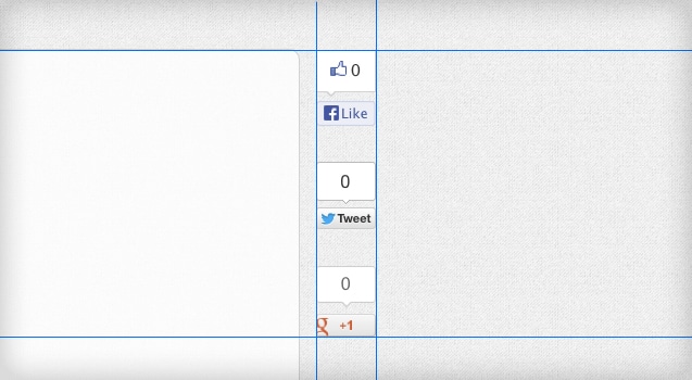
It’s clear that Facebook, Google+, and Twitter are all crucial to social media efforts. Unfortunately, the three don’t play nice when you want to integrate all 3 widgets together. What often ends up happening is they have different widths, heights, and styling.
The fact most of these widgets use a complex combination of “iFrames within iFrames” and asyncronous Javascript makes trying to style these with conventional CSS a complete nightmare.
Thankfully, after some digging, I’ve discovered an elegant solution to create vertical box widgets that all have similar styling: CSS3 “Scale”.
CSS3 Scale
Since some widgets are wider than others, I was able to conveniently scale smaller widgets to be the same width as the others with CSS3. Here is the (cross-browser friendly) CSS:
transform: scale(1.1);
-ms-transform: scale(1.1);
-webkit-transform: scale(1.1);
-o-transform: scale(1.1);
-moz-transform: scale(1.1);
transform-origin: bottom left;
-ms-transform-origin: bottom left;
-webkit-transform-origin: bottom left;
-moz-transform-origin: bottom left;
-webkit-transform-origin: bottom left;
Note that you can adjust these amounts up to two decimal points (I haven’t tried more than that, but more might be possible if you really are pixel-pushing). For example, scale(1.15);
Let me know in the comments below if this helped you!


great tutorial, simple and just what I was looking for. Thanks!