
 No comments yet
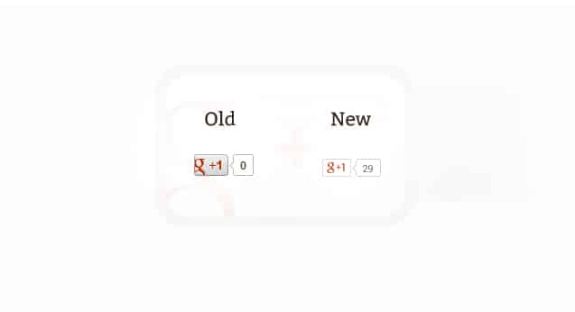
Looks like the +1 button has gone through another design update on November 8 at 12:01 AM. Google seems to be making a total shift over to the flat “iOS-7” style design for their buttons, logo, and design elements across their websites and products.
The design is much simpler, but also tends to blend in much easier, and is less interesting than the old design. It also seems a bit rough around the edges; the total +1 count also appears to hang a bit too low. Maybe this is one of Google’s infamous split tests?
This is the third major redesign of the +1 button. How do you like it? Let me know your comments below!