

Having built hundreds of websites, I’ve created my fair share of favicons over the years. It’s rare that I actually work on a favicon for more than an hour, but after seeing some of the really cool custom favicons out there, I wanted one of my own for my blog.
I was inspired by a tutorial by Photon Storm, who are famous for their amazing artwork.
1. Getting Started
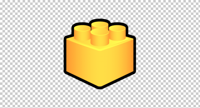
I decided to choose a Lego brick as my favicon. Lego bricks have long been associated with website design and development, and I love Legos as well. I was inspired by this icon; while the artwork is rather boring, I really liked the perspective of the image.
2. The Outline
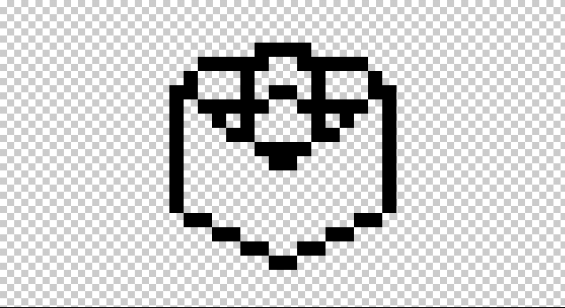
I followed the great tutorial linked above that PhotonStorm.com put together, and started by creating an outline based on the Lego image I picked out. It looks a little rough around the edges, but there’s only so much you can fit into a 16×16 pixel area, right?
3. Filling
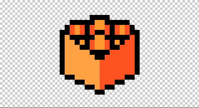
Next on the tutorial was filling. I chose these two tones because I’m a fan of redorange. I’m starting to visualize what this is going to look like with shading.
4. Shading and Highlights
This part of the tutorial was actually pretty easy for me. I put some highlights where I thought the cube should have some reflections/highlights, and put some darker colors around the edges for shadows. I had to play with the colors quite a bit and zoom out to make sure everything looked good at 16×16 pixel size.
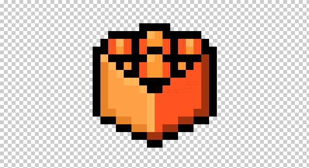
5. Colorizing The Outline
This was the most difficult and time consuming part of the tutorial for me, and I realized this step makes or breaks your design. I used many layers to carefully colorize and fade areas of the outline to look natural. The fact this little Lego brick was so detailed (especially the top area) made this pretty difficult. I frequently went back and forth from actual-size to zoomed-in to make sure the colors looked okay at actual size.
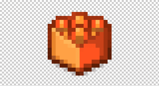
6. Finishing Touches
There wasn’t a “finishing touches” area of the PhotonStorm.com tutorial, but I felt it needed one. My favicon wasn’t perfect after colorizing the outline, and I went back to touch up parts of the shading, added some more highlighting, and even tweaked the contrast/hue a bit. Here is the finished product:

Actual size:
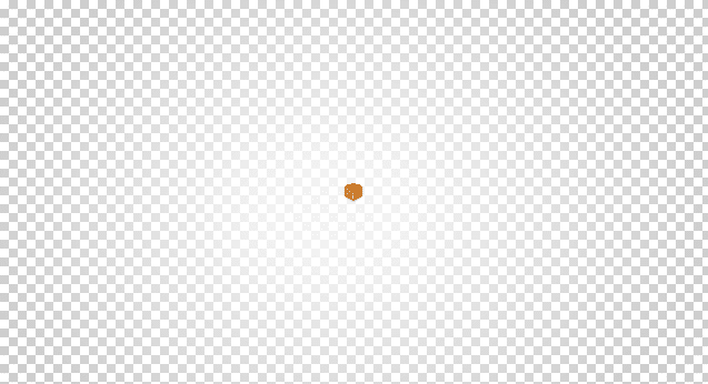
Total creation time: 1 hour 15 minutes
Did you design a favicon after seeing this post? Let’s see it; post in the comments below!
Great advice! Always make sure to keep track of the whole picture, remember to zoom out while making pixel art
Thank you!