

I love Namecheap.
I hate their new design and user experience.
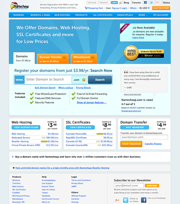
Namecheap redesigned their homepage in 2013, and I loved the changes. The website was more attractive, easier to use, and bolstered their image. They clearly had a professional working under their roof, and it was the nicest their website has ever looked. I rate their old design a 9.5 out of 10.
Here’s Namecheap’s website in 2013:
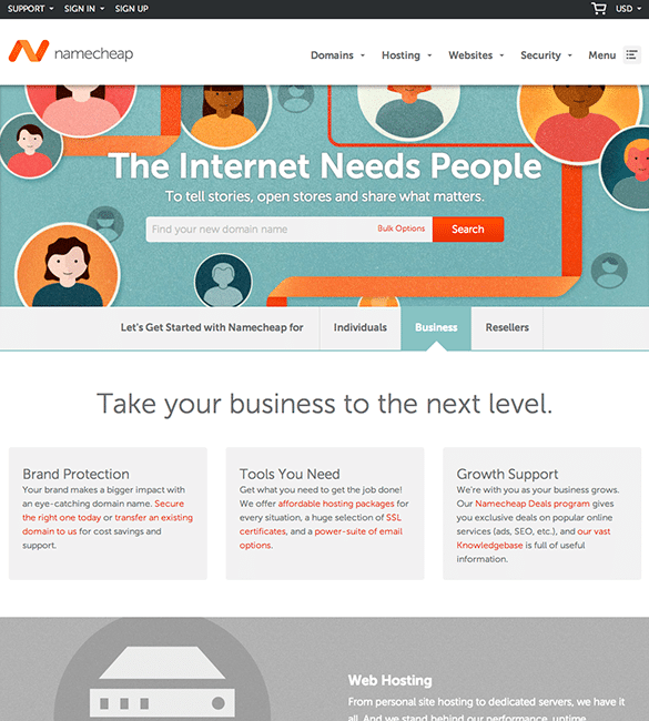
In January 2014, Namecheap redesigned their homepage and inner pages of their website, and the results are disastrous. The designer they hired has no user-experience knowledge, and the Namecheap executives decided that this “friendly” design is more important. I have a strong feeling their new user signups and sales have decreased since this has rolled out.
Now, again, I love Namecheap as a registrar, but here’s what’s concerning to me.
Namecheap is receiving a lot of negative feedback on the design, but they are mis-understanding this feedback as people unhappy with how parts of the site are still under construction, and not that the new design is actually terrible for user-experience, and is less attractive than the previous website. Hopefully they take this feedback seriously soon. I rate their new design a 4 out of 10.
Here’s Namecheap’s website in January 2014:
I think Namecheap needs more feedback so they know how their users feel about this. Shoot an email to feedback [at] namecheap [dot] com to let them know how you feel. If enough people pitch in their opinion, they will do something about it.
How do you feel about the new design? Leave a message in the comments below.
The new design doesn’t reflect the position of the brand. They are called Namecheap for a reason – it needs to be accessible and fast to use, with a design that helps people find what they need without any fluff. As much as I like the aesthetic and funkiness of the new site, it doesn’t say anything about what it does. Goes to show that its not just one thing that makes a brand work but multiple areas working together…
I agree. User experience should be number one with design as an afterthought; looks like they decided to do it the other way around. I hope they fix it!
As Namecheap’s community manager, I wanted to respond to this, Phoebe: our brand has taken a pretty heavy focus on people — that’s what we speak to at our company. There’s no fluff there. We want to give people a simple user experience while conveying that people are at our company’s core.
We’re listening to feedback and taking action. Please use the email address provided by James in his post if you have anything you’d like us to address. Thanks!
I just want to speak as Namecheap’s community manager in that we are actively addressing relevant criticisms of our website every day. If you have anything you want to suggest, we are listening and logging each and every piece of information to address and evaluate. In short, yes, that email address is a good one (but James, please do us the service of putting it in a format like james at parsons dot me so we don’t get spammed to death 😉 ) and we look forward to your feedback.
Thanks for your comment Tamar 🙂 I’ve modified the email accordingly. Feel free to email me at any time.